Superior Healthcare
Brand Design
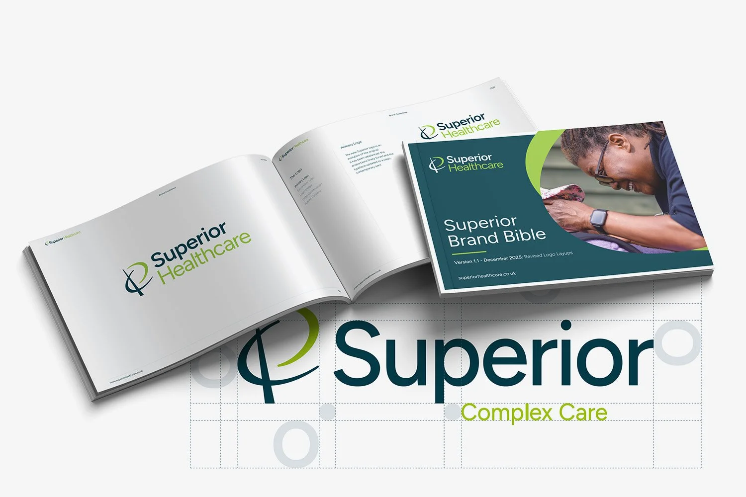
Logo Design
Print Design
Brand Guidelines
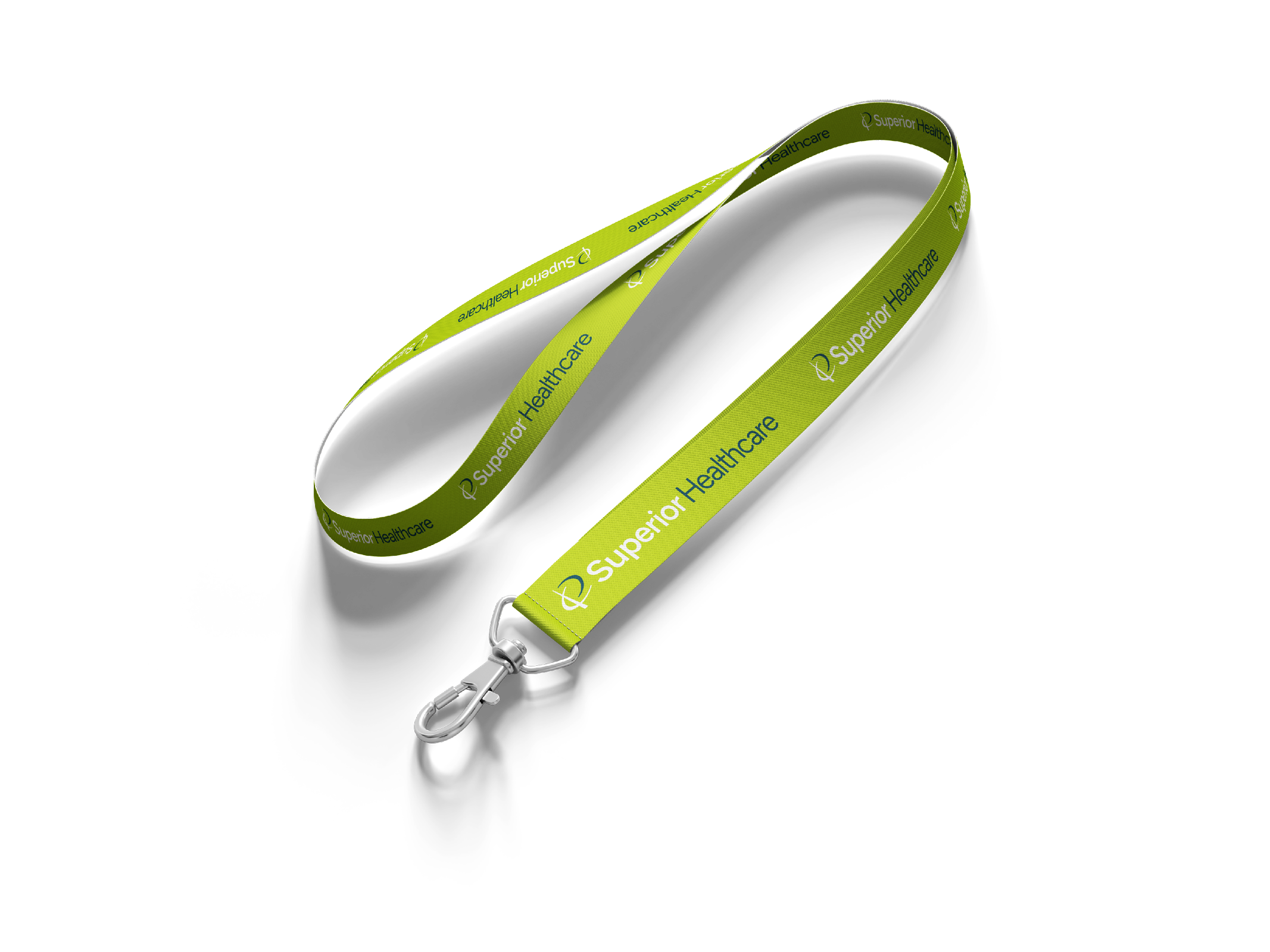
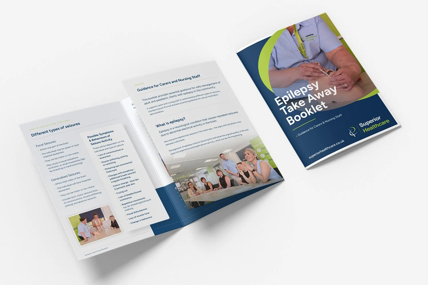
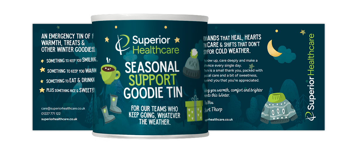
A suite of new print collateral was designed Superior Healthcare, as part of a long term brand refresh project.
While a new logo was floated, a refinement of the existing logo was chosen to retain brand recognition and allow a phased rollout to be implemented across the course of several months.
Alongside the logo overhaul, all existing print collateral is set to be updated and replaced on a rolling basis, a project spanning around 12 months.
The updated logo stays true to the well recognised original - with refined typography and a finely honed icon.
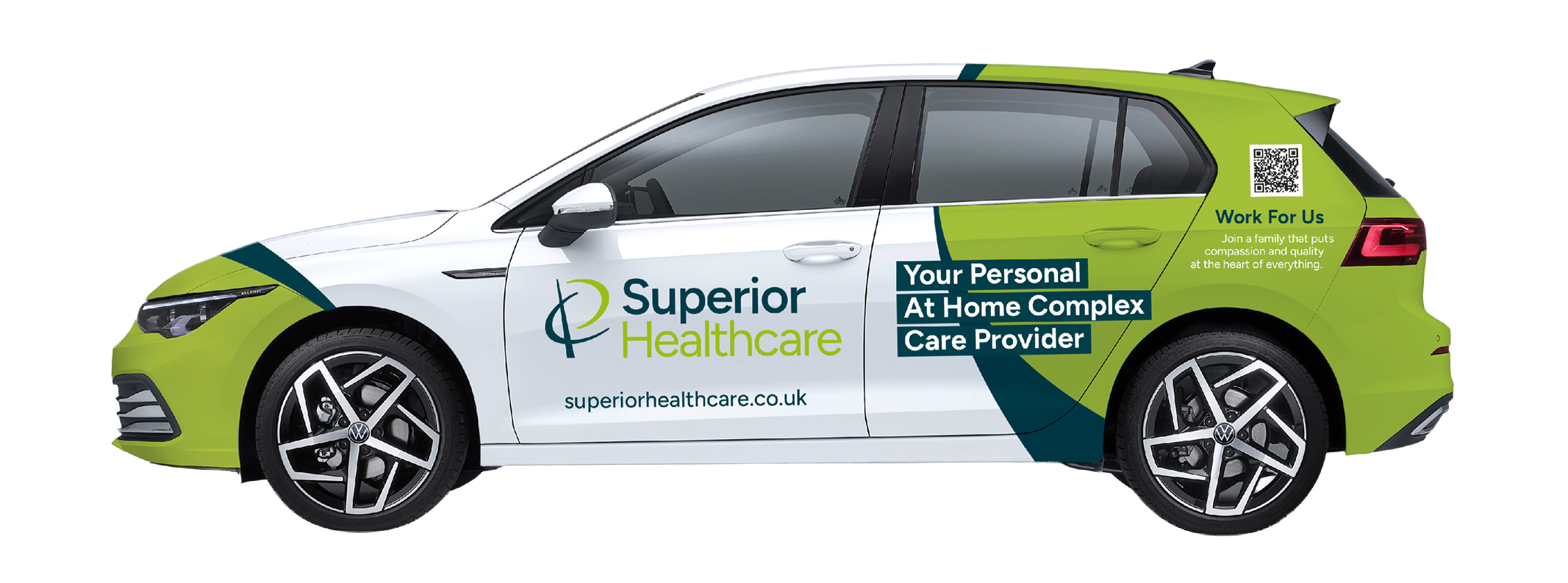
Due to the vast amounts of collateral Superior owns, including more than 60 wrapped vehicles and multiple offices, meant an overnight rebrand was going to be costly and difficult to manage.
This refresh means items are replaced as needed, with the updated look. Print materials are replaced as they are depleted and new company vehicles wrapped in the new branding as they are renewed.